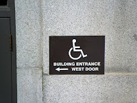
For this walkabout, our group looked at signs around the University of Utah campus. Most of the signs we saw catered towards modes of transportation. This is due to the fact that the U is a commuter campus. These signs help the viewer be more cautious of their surroundings. Whether it is automobiles, bicycles, or pedestrians, these signs help direct the flow of traffic and direct people where to go. Many of these signs were relatively small, but they still stuck out. This is largely due to the vibrant colors of the signs. A lot of these signs used images to support their message.


While many of these signs were small, some were fairly large. These signs were university signs rather than government signs. They were either decorative or directory signs. This type of signage adds to the persona of the university. They help students navigate the campus and adds visual aesthetics to the campus.


As well as navigation signs, there were also many signs to help the handicapped people on campus. Many buildings had signs to help these citizens find a safe route to their destinations. These signs were often a brilliant, blazing red so they were easily recognizable. Come rain or shine (or in this case snow), these citizens would be able to find their way.


Even though there has always been signs on our walkabouts, this walkabout showed us just how important they are. The signs on the University of Utah's campus represent its inhabitants. Everyone is welcome to take part in campus life. These signs also show how eco-friendly the campus tries to be as they try to make public transportation the primary mode of transportation for the campus. While many people still drive, the U increasingly makes public transportation options available. This is apparent in the type of signs we saw on campus. All in all, the signs on our campus create an organized and beautiful campus.

No comments:
Post a Comment